How to Boost Product Success with User Experience Analytics
Discover how to build a UX analytics strategy that turns insights into action, improves digital experiences and drives measurable business growth.

Discover how to build a UX analytics strategy that turns insights into action, improves digital experiences and drives measurable business growth.
Many businesses struggle to understand how users interact with their digital products. This leads to frustration, poor user retention and missed opportunities for improvement.
Without actionable insights, optimizing designs and addressing user pain points becomes difficult. As a result, customer satisfaction and business growth suffer.
A well-designed user interface can boost conversion rates by up to 200% and superior UX can drive conversions as much as 400%. In this blog, we’ll explore how UX analytics can transform your product and drive success.
User experience (UX) analytics refers to the process of collecting, analyzing and interpreting data related to how users interact with a digital product or service. This involves tracking user behavior, identifying patterns and assessing how well the product meets user expectations. The goal is to improve the overall experience for the user.
UX analytics plays a vital role in guiding product design and development decisions. It offers insights into user behavior, preferences and pain points. Identifying usability issues early helps improve product performance, user retention and customer satisfaction.
Key objectives:
Understanding how users interact with your product is key to creating better experiences. Here’s how UX analytics helps enhance business.

Data-Driven Decision Making
Companies leverage real user behavior data to make informed decisions, eliminating guesswork and assumptions. Strategic changes in design and product development align perfectly with actual user needs, minimizing implementation risks while maximizing success rates.
Enhanced Customer Satisfaction
Enterprises quickly identify and resolve pain points when analyzing user journeys as well as interaction patterns. The proactive stance toward user experience management creates higher satisfaction rates, stronger customer loyalty and elevated brand perception among users.
Improved Conversion Rates
Businesses analyze detailed funnel analysis and user behavior tracking to reveal critical drop-off points along with optimization opportunities. Teams can optimize their conversion paths, leading to increased conversion rates and maximized return on investment from digital channels.
Cost Reduction
Corporations detect usability issues early during development to prevent expensive redesigns and updates. Industry leaders save significant resources while ensuring improvements target areas most valuable to users.
Competitive Advantage
Firms gain market leadership through deep understanding of user behavior and preferences. Superior digital experiences emerge from comprehensive analytics, setting products and services apart in crowded markets.
Performance Monitoring
Tech companies track real-time key performance indicators to ensure excellence in user experience. Market players maintain high-quality user interactions across digital touchpoints through systematic assessment and adjustment.
Personalization Opportunities
Digital enterprises analyze advanced user behavior patterns enabling tailored experiences. Service providers deliver more relevant content and features to distinct user segments, increasing engagement as well as satisfaction.
Wondering how to start gathering real insights from your users? This 10-step UX analytics strategy will help you just right.

Setting clear goals and KPIs is the foundation of any strong UX analytics strategy. Without defined success metrics, it’s hard to know what’s working or if your efforts are actually paying off.
That’s why it’s important to ask open-ended questions like “What does success look like for our users?” or “Which behaviors signal a positive experience?” These answers help shape the KPIs you track.
Use analytics dashboards and regular reviews to monitor progress, spot areas for improvement, as well as show how your UX decisions are driving real business results.
Pro tips:
Choosing the right UX analytics tools can feel overwhelming, but it’s all about finding what fits your goals, budget and technical setup.
Start by asking open-ended user experience survey questions like, “Where do users struggle most in our product?” or “What part of the experience feels confusing?”. These will guide you toward tools that deliver the insights you really need.
Compare platforms based on features, ease of integration and cost. Begin with essential tools that track basic user behavior and as your needs grow, layer in more specialized tools for deeper analysis without overcomplicating your stack.
Tips:

A user journey map is a visual way to understand how people interact with your digital product, from their first visit all the way to completing a key action like signing up or making a purchase.
It shows not just what they do, but how they feel at each step. By combining this with user insights, you get a clearer picture of where things are working and where users might be getting stuck or frustrated.
Mapping out different user segments as well as touchpoints helps you spot patterns, uncover pain points and use your analytics more effectively to improve the overall experience.
Pro tips:
Technology that captures and records real users’ interactions with your digital product, including mouse movements, clicks, scrolling patterns, form interactions, etc.
Session recordings provide direct insight into how users actually interact with your product, revealing usability issues and unexpected behaviors that might not be apparent through other analytics methods.
Regularly review session recordings to identify common patterns, usability issues and areas of friction. Use insights to inform design decisions and prioritize improvements based on actual user behavior.
Pro tips:
Visual representations of user behavior showing where users click, move their mouse and scroll on your pages, using color gradients to indicate areas of high as well as low engagement.
Heatmaps provide immediate visual insights into how users interact with your content and interface elements, helping identify what attracts attention as well as what gets ignored.
Analyze click patterns to optimize button placement, evaluate content engagement through scroll maps and identify areas of user interest or confusion through movement heatmaps.
Tips:

A systematic tracking system that monitors user progression through predefined stages leading to desired actions, mapping out the complete path from initial interaction to final conversion goal.
Conversion funnels help identify where users drop off in their journey and quantify the impact of each step on final conversion rates. They provide crucial insights for optimizing the path to conversion.
Monitor drop-off rates at each funnel stage, analyze user behavior at critical points, and use data to optimize each step of the conversion process through targeted improvements.
Tips:
Event tracking lets you dive deep into how users interact with your product, like which buttons they click, forms they fill out, or features they use most. It’s a powerful way to gather user insights that go beyond general traffic data.
Tracking specific events will enable you to see what’s engaging users, what they’re ignoring, and how they move through your product. This helps you measure feature adoption, understand user behavior patterns and make smarter decisions about design or development. Simply put, it turns every interaction into a data point you can act on.
Pro tips:

Direct user feedback gives you the “why” behind the numbers. By using surveys, feedback forms, ratings, or interviews at key points in the user journey, you get valuable context that pure analytics can’t offer.
Ask for input after major interactions or events to understand how users really feel. When you combine these insights with behavior data, you can make smarter, more user-focused improvements to your product experience.
Tips:
A regular UX analytics review schedule keeps your team aligned and proactive. Instead of waiting for problems to surface, you’re consistently monitoring metrics, spotting trends early, and making informed decisions.
Set up a recurring cadence (weekly or monthly) to review key data points, share user insights, and decide on next steps.
Use consistent reporting templates so everyone’s looking at the same metrics and build a clear process for turning those insights into actions. It keeps your UX efforts focused, measurable, and always moving forward.
Tips:

Turning user insights into action takes more than just data. It requires a clear, structured plan. An action plan helps your team move from “we noticed this” to “here’s what we’re doing about it.”
Use frameworks to prioritize what matters most, align changes with business goals, and allocate resources where they’ll have the biggest impact. Don’t forget to test improvements before a full rollout.
This way, you’re not just collecting feedback, you’re using it to drive measurable, meaningful results.
Pro tips:
To truly understand user behavior, you need to track the right UX metrics. These key indicators help you measure usability, engagement and overall experience quality.

Task Success Rate
This measures how many users complete the task they set out to do, like making a purchase or filling out a form.
A high success rate means your interface is doing its job well. A low one? That usually signals friction, confusion, or poor design. For complex tasks, it’s helpful to break things down step by step to see exactly where users drop off.
Time on Task
How long does it take users to complete an action? Tracking this tells you whether a task is smooth or frustrating.
If the time suddenly spikes, there could be a usability issue or a technical glitch. It’s especially useful to compare time on different devices to uncover mobile-specific challenges.
User Error Rate
When users make mistakes (whether it’s a form error, a wrong click, or a failed submission) it often points to unclear design or confusing flows.
Analyzing common errors can help you clean up those trouble spots and create a more intuitive experience.
Bounce Rate and Exit Rate
If users land on your site and leave without doing anything (bounce) or exit from specific pages (exit rate), it could mean your content isn’t meeting their needs or expectations.
High numbers on key pages are a red flag and worth a closer look.
Feature Adoption Rate
This shows how many users actually use your features. Low adoption might mean people aren’t discovering them or they’re just not helpful.
Tracking adoption trends helps guide rollouts and improvements.
Customer Satisfaction Score (CSAT)
User feedback combined with behavior data gives you the full picture.
Surveys at key touchpoints tell you how users feel, while trends over time highlight where satisfaction is rising—or falling.
Curious how data can actually transform UX? These real-world examples show how leading companies used survey responses to improve usability, engagement and results.
Netflix’s Personalization Engine
The streaming giant used extensive viewing behavior data to improve their recommendation system. Analysis of user watching patterns, pause points and content engagement helped refine their interface as well as personalization algorithms.
Their continuous A/B testing led to improved thumbnail selection, resulting in a 20-30% increase in user engagement. The data-driven interface improvements saved the company an estimated $1 billion in annual customer retention.
Airbnb’s Search Experience
The platform analyzed user search patterns and booking behaviors to optimize their search interface. Studying millions of user interactions revealed that travelers often struggled with location-based searches.
The company implemented a more intuitive map-based interface and smart filters, leading to a 12% increase in booking conversions. They also optimized their mobile experience based on touch-pattern analysis.
Spotify’s Discover Weekly
Feature In-depth analysis of listening patterns and user behavior led to the creation of their highly successful personalized playlist feature.
Data showed users were spending significant time creating custom playlists, leading to the development of automated, personalized recommendations. The feature has become one of their most popular offerings with over 40 million users engaging weekly.
LinkedIn’s Profile Completion
Analysis of user engagement patterns showed profiles with higher completion rates led to better networking outcomes.
The company implemented a profile strength meter and guided profile completion process. These data-driven changes resulted in a 55% increase in profile completeness and higher user engagement rates.
To get real value from UX analytics, you need more than just data, you need the right approach. These best practices help you turn raw numbers into meaningful user improvements.

Track User Behavior
Monitor user interactions such as clicks, scrolling and session length to identify usability issues. Understanding how users engage with your product reveals areas needing improvement. This data is vital for refining design elements and creating a more intuitive experience.
Segment User Data
Segmenting data based on demographics, behavior, or device type provides deeper insights into user needs. Understanding the unique preferences of different groups allows you to tailor your optimizations. This targeted approach ensures better user satisfaction and overall effectiveness.
Focus on Task Flows
Examining the user journey and task completion rates reveals areas of friction. Understanding how users accomplish tasks helps identify roadblocks that may hinder progress. Streamlining these task flows ensures a more efficient and enjoyable experience.
Conduct Usability Testing
Usability testing with real users uncovers issues early in the design process. It offers valuable feedback through direct observation or surveys. Ensuring your product meets users’ needs leads to improved satisfaction and better results.
Measure Conversion Metrics
Conversion metrics are essential for assessing UX effectiveness. Tracking actions like sign-ups, purchases, or downloads shows how well your product drives desired outcomes. Analyzing these metrics helps pinpoint areas needing optimization to boost conversions.
Action-Oriented Reporting
Create clear, actionable reports that highlight key insights and recommended improvements. Present data in formats that stakeholders can easily understand and act upon. Include specific recommendations based on analytics findings.
User Experience Analytics offer critical insights that help businesses refine their digital products. Understanding user behavior and identifying pain points allows for continuous optimization. Creating more intuitive, engaging experiences boosts customer satisfaction while driving conversions and retention.
Prioritizing UX analytics fosters growth and competitive advantage in the ever-evolving digital space. As user needs and expectations shift, using these analytics ensures your product remains relevant while delivering exceptional experiences that support long-term success.
How does user experience analytics differ from traditional web analytics?
User experience analytics focuses on qualitative aspects of user behavior, including interaction patterns, heatmaps, session recordings and user journey analysis. While traditional web analytics emphasizes quantitative metrics like pageviews and bounce rates, UX analytics delves deeper into understanding why users behave certain ways, their frustrations, as well as emotional responses during interactions with digital products.
What metrics are typically analyzed in user experience analytics?
UX analytics examines metrics such as time on task, error rates, success rates, user flow paths, rage clicks, dead clicks and scroll depth. Additional measurements include form abandonment rates, interaction time with specific elements, return user behavior patterns and user satisfaction scores. Advanced metrics also track micro-interactions, gesture analysis and cross-device usage patterns.
What are some common tools used for user experience analytics?
Popular UX analytics tools include Hotjar for heatmaps and session recordings, Google Analytics for traffic analysis, Mixpanel for user behavior tracking, and Omni24 for digital experience intelligence. Additional platforms like Heap, Amplitude, and Pendo offer comprehensive UX analytics features. Some organizations combine multiple tools to capture different aspects of user experience.
Why should businesses invest in user experience analytics tools?
Investment in UX analytics tools delivers measurable ROI through increased conversion rates, reduced customer support costs, and improved customer retention. These tools help identify usability issues before they impact business metrics, enable data-driven design decisions, and provide competitive advantages through superior user experiences. Understanding user behavior leads to more effective product development and marketing strategies.
What role does user feedback play in user experience analytics?
User feedback complements quantitative UX analytics by providing direct insights into user thoughts, preferences, and pain points. Feedback mechanisms like surveys, interviews, and user testing sessions validate analytics data as well as provide context for observed behaviors. The combination of direct feedback and analytics creates a comprehensive understanding of user experience issues along with opportunities.
 https://omni24.io/wp-content/uploads/2026/07/Customer-Data-Platform.png
1256
2400
Tushar Joshi
https://omni24.io/wp-content/uploads/2023/04/Omni-Logo-1.svg
Tushar Joshi2026-07-08 03:58:592026-07-08 03:58:59How a Customer Data Platform Unlocks Unified Customer Insights
https://omni24.io/wp-content/uploads/2026/07/Customer-Data-Platform.png
1256
2400
Tushar Joshi
https://omni24.io/wp-content/uploads/2023/04/Omni-Logo-1.svg
Tushar Joshi2026-07-08 03:58:592026-07-08 03:58:59How a Customer Data Platform Unlocks Unified Customer Insights https://omni24.io/wp-content/uploads/2026/07/Unified-Customer-View.png
1256
2400
Tushar Joshi
https://omni24.io/wp-content/uploads/2023/04/Omni-Logo-1.svg
Tushar Joshi2026-07-07 03:37:342026-07-07 03:37:34How a Unified Customer View Transforms Customer Experience
https://omni24.io/wp-content/uploads/2026/07/Unified-Customer-View.png
1256
2400
Tushar Joshi
https://omni24.io/wp-content/uploads/2023/04/Omni-Logo-1.svg
Tushar Joshi2026-07-07 03:37:342026-07-07 03:37:34How a Unified Customer View Transforms Customer Experience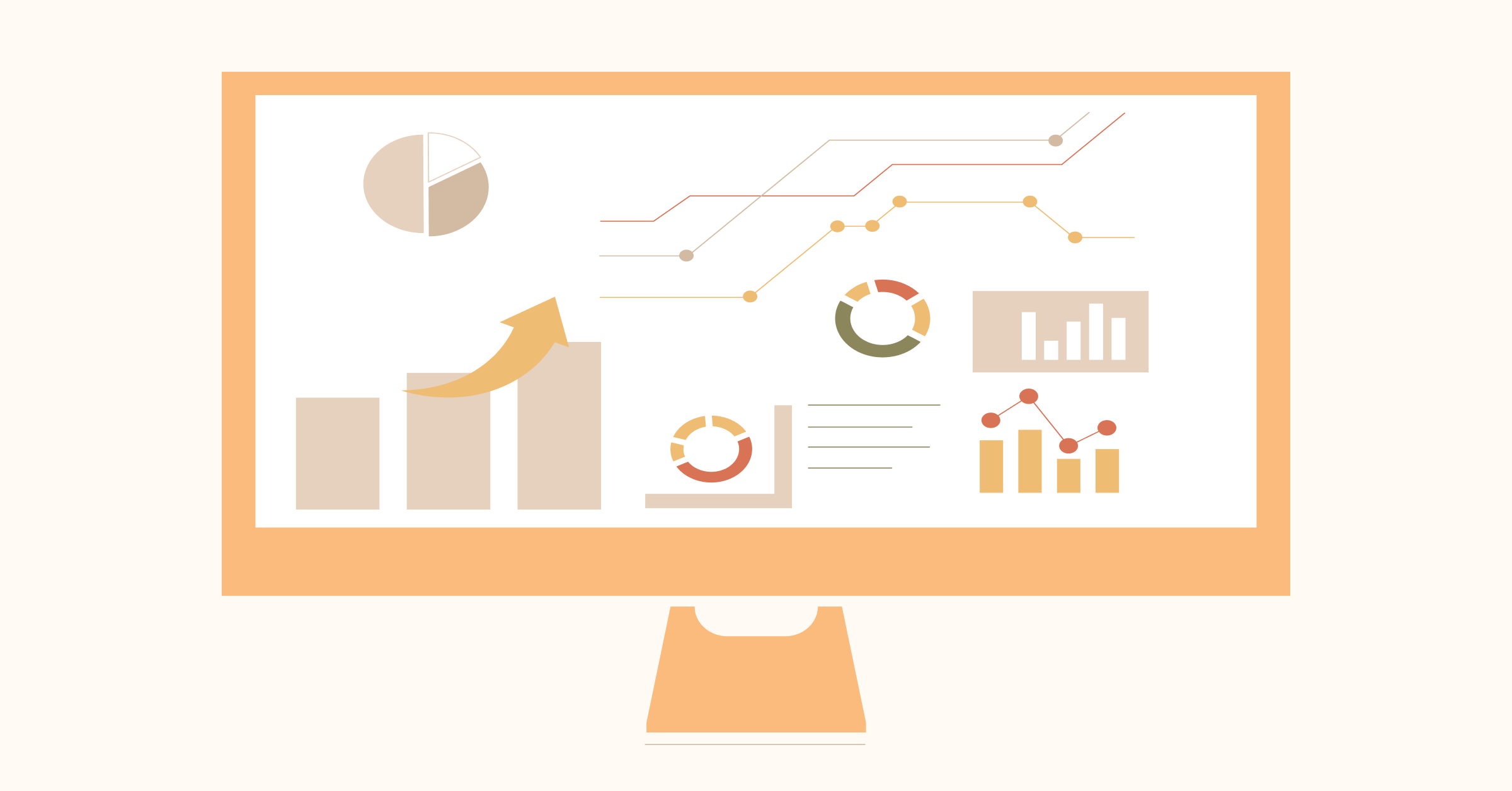 https://omni24.io/wp-content/uploads/2026/06/Omnichannel-CRM.png
1256
2400
Tushar Joshi
https://omni24.io/wp-content/uploads/2023/04/Omni-Logo-1.svg
Tushar Joshi2026-07-06 03:49:012026-07-06 04:00:22How to Implement Omnichannel CRM Strategy: 7 Key Steps
https://omni24.io/wp-content/uploads/2026/06/Omnichannel-CRM.png
1256
2400
Tushar Joshi
https://omni24.io/wp-content/uploads/2023/04/Omni-Logo-1.svg
Tushar Joshi2026-07-06 03:49:012026-07-06 04:00:22How to Implement Omnichannel CRM Strategy: 7 Key Steps
Whether it’s about acquire, engage or support – Omni24 covers all your customer engagement needs in one complete platform.
![]()
Copyright ©2026 Veemo All rights reserved.
CA, Los Angeles, Hall Ave, 19011